Which wall should I feature?
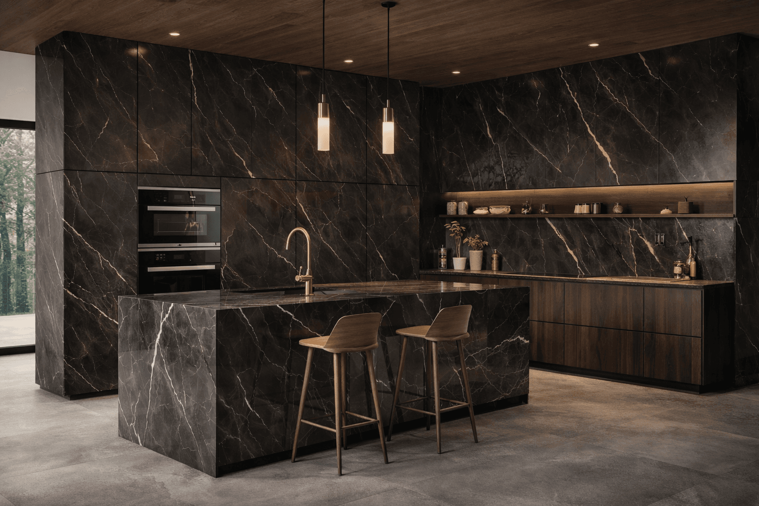
The rule of thumb: choose the most dominant line of sight. In most living rooms that's the wall opposite the sofa — so the TV wall, or the wall with the sideboard or shelving. This wall carries the most visual weight; emphasising it reinforces the room rather than fighting it.
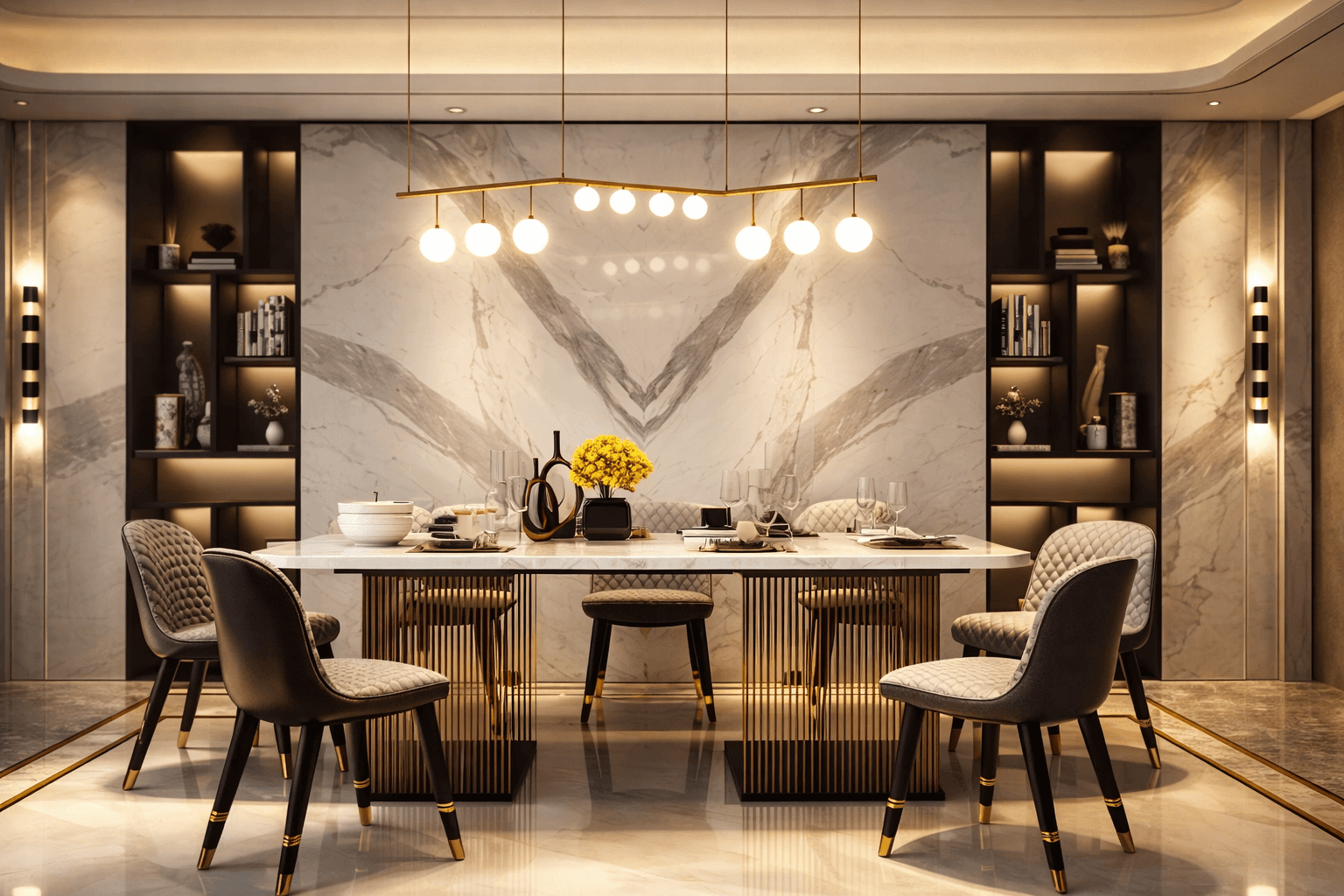
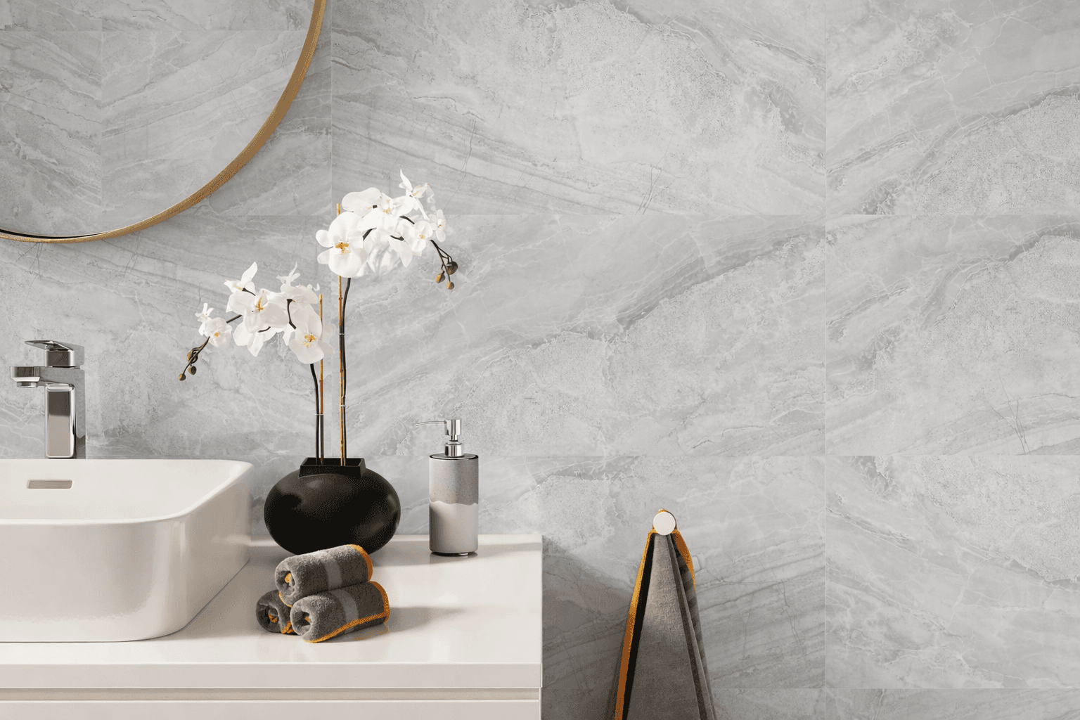
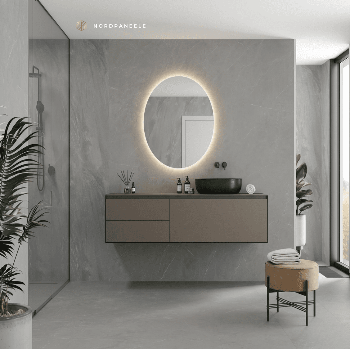
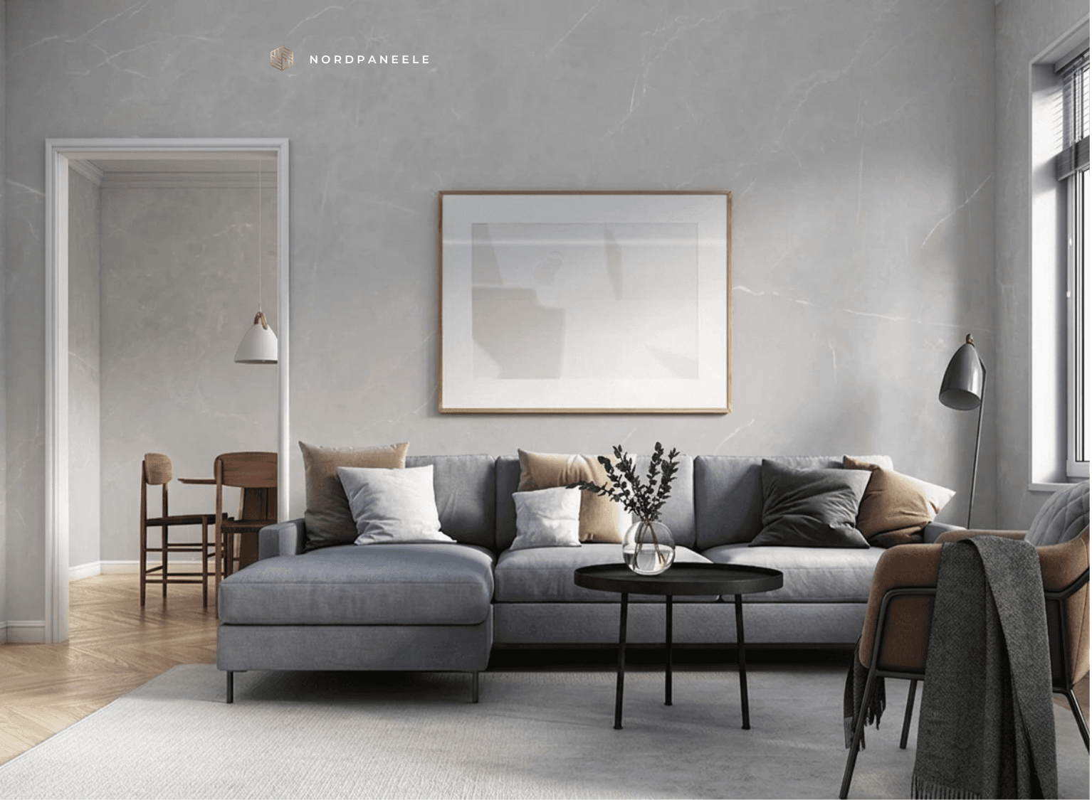
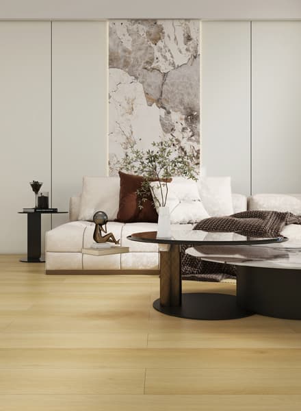
Second option: the wall behind the sofa. Here a marble or stone look acts as a photographic backdrop and turns every couch setting into a magazine shot. Third option: the wall behind an open staircase in a maisonette — light plays beautifully across the panel surface.
Light or dark panel tone?
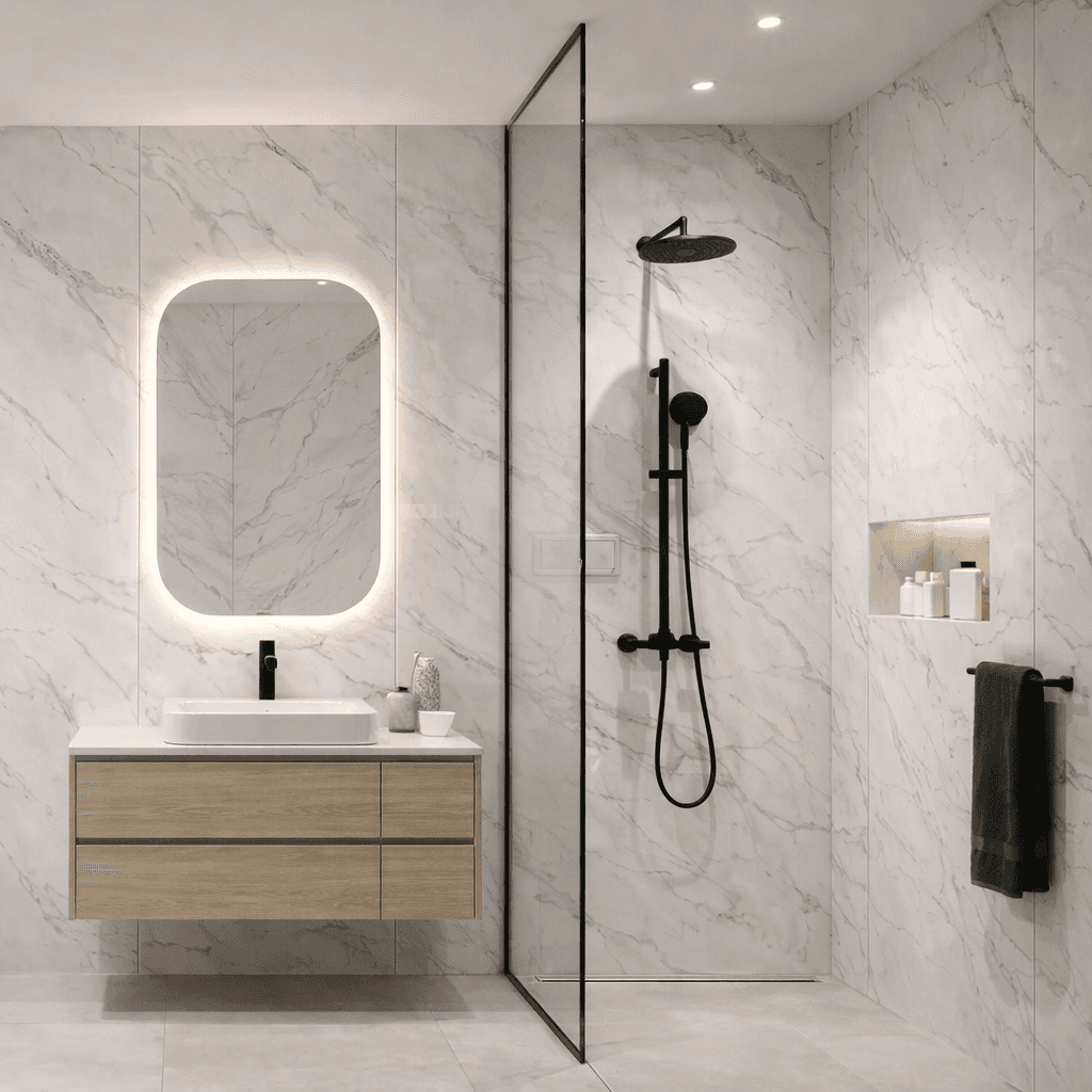
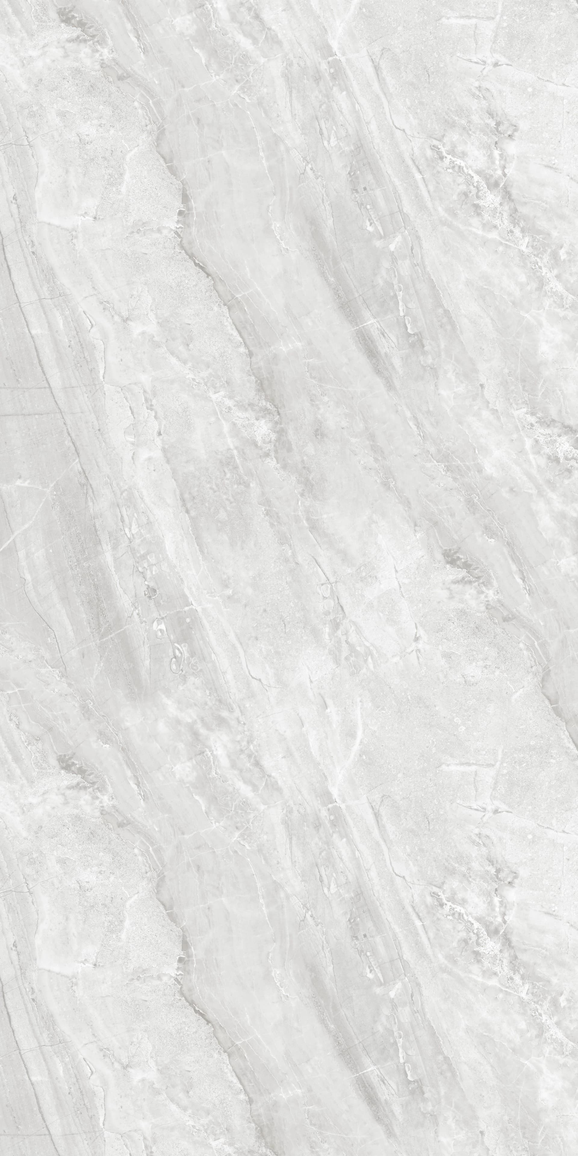
Light tones (Carrara white, Chiaro concrete, light stone looks): visually enlarge rooms, brighten them, work with daylight. The best choice for north-facing rooms or living rooms with limited window area.
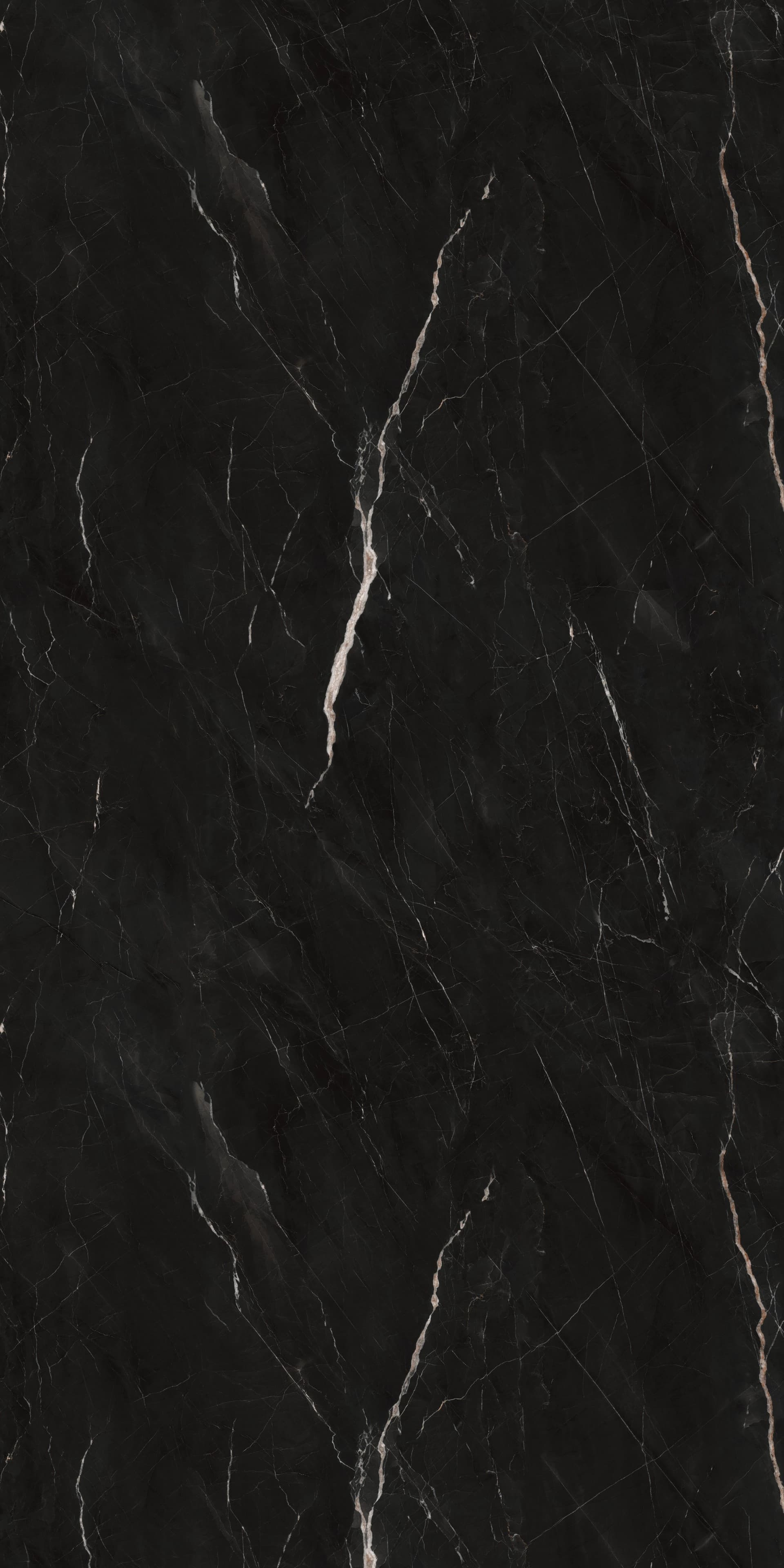
Dark tones (anthracite concrete, dark slate, Calacatta with dark veining): add depth and drama, make smaller rooms feel more intimate, contrast more strongly with light furniture. Ideal as a TV wall and for rooms with plenty of daylight.
Can't decide? Our free samples cover the most popular looks — we recommend holding two or three candidates against the wall and living with them for a day or two. The decision usually makes itself.
Style guide: panels for each interior style
Scandinavian: light concrete (Naturale, Chiaro) or soft marble (Carrara). Restrained, warm, understated.
Industrial / loft: anthracite concrete or dark slate. Pairs with metal accents, exposed-concrete floors, warm wood tones.
Classic-elegant: Carrara or Statuario in glossy. Combined with muted tones like sage green, dusky pink or taupe.
Modern minimalist: uniform light marble look across a large surface, paired with very sparse furniture and plenty of white.
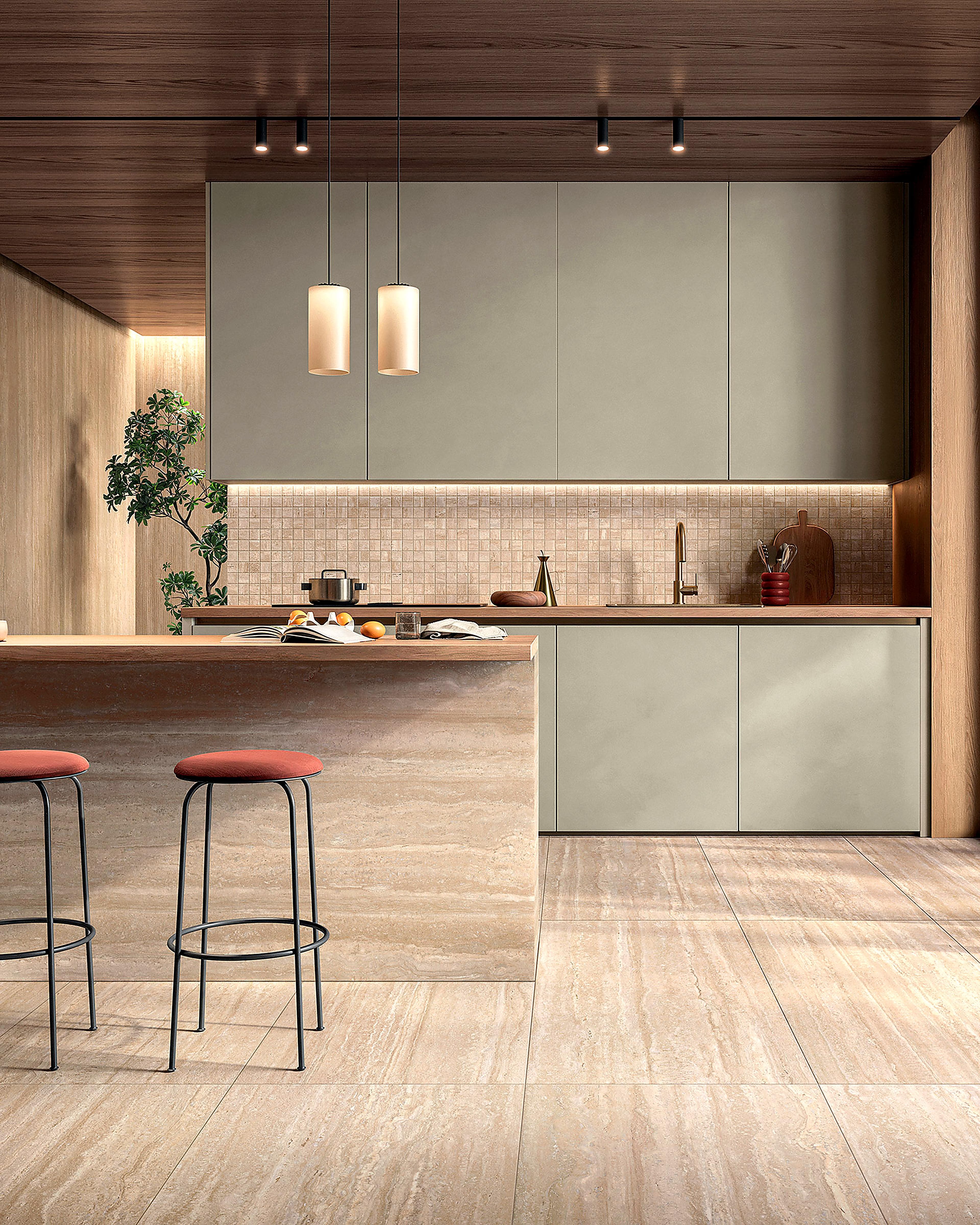
Mediterranean: Travertino Naturale or warm concrete. Earth tones, wood, clay — works with terracotta or natural-stone flooring.